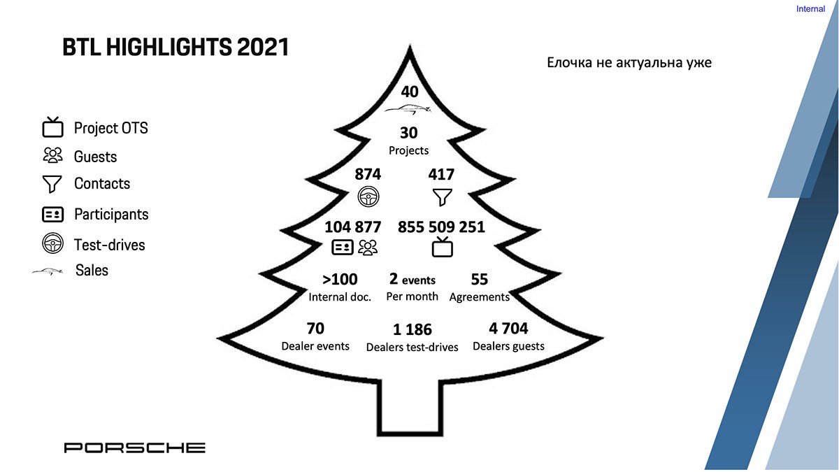
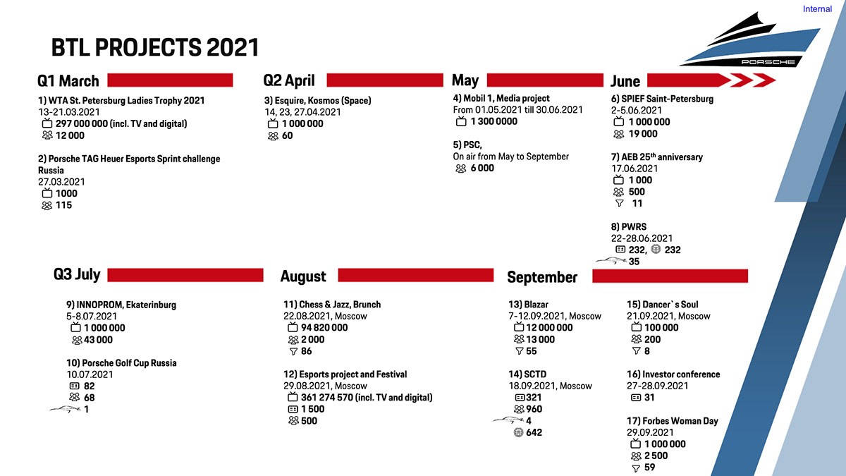
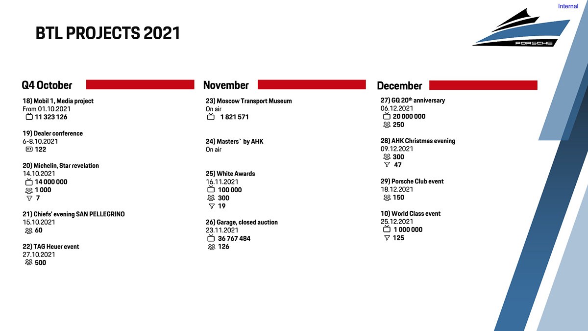
Data-heavy Presentation
Redesign
Project Overview
This case study highlights our successful endeavor in redesigning a presentation for Porsche. Initially, I was provided with a data-heavy presentation, which made it challenging to read due to the dense content on each slide.
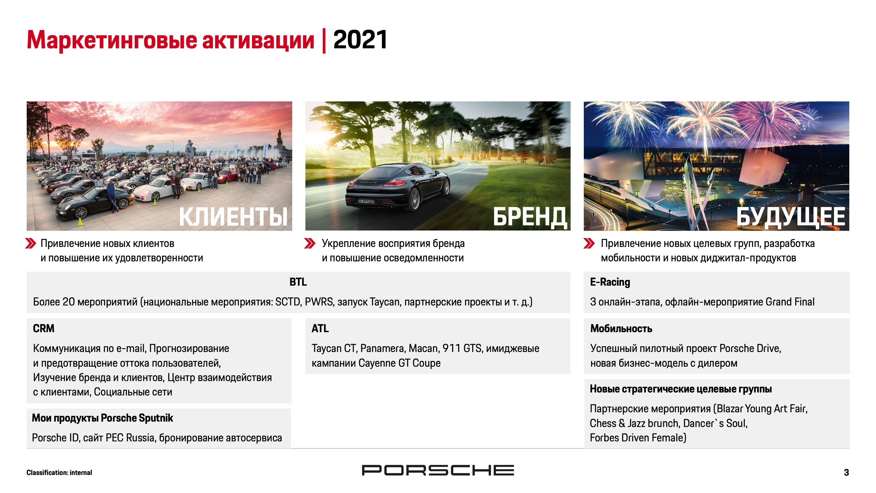
Before
To enhance the visual appeal and readability, I proposed expanding the number of slides and incorporating captivating visuals, including client photos. Additionally, I introduced animated elements by working with a timeline. The first version featured added visuals and initial layout of content blocks.
Work in Progress
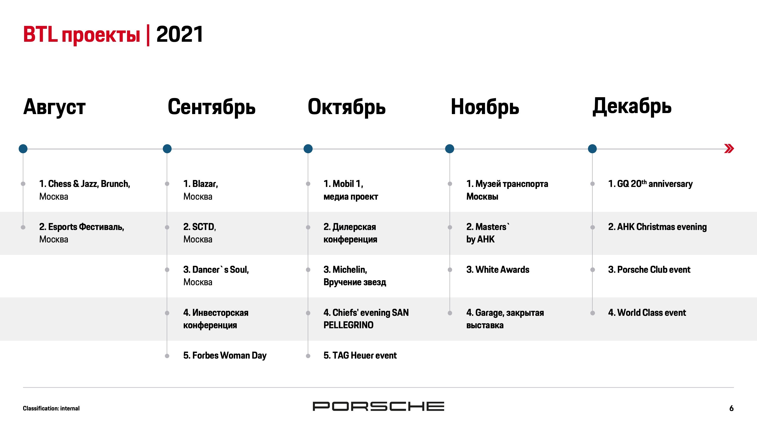
Stage 1
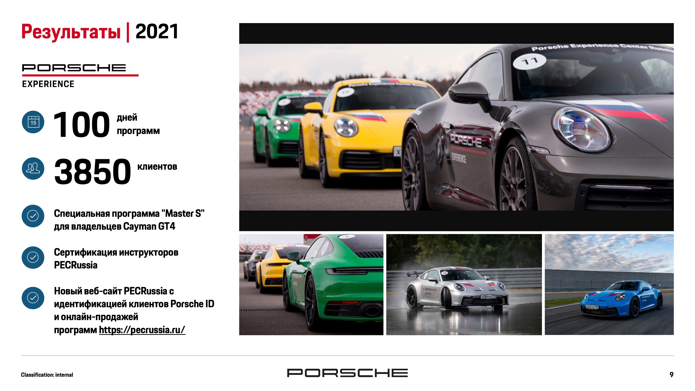
Stage 2
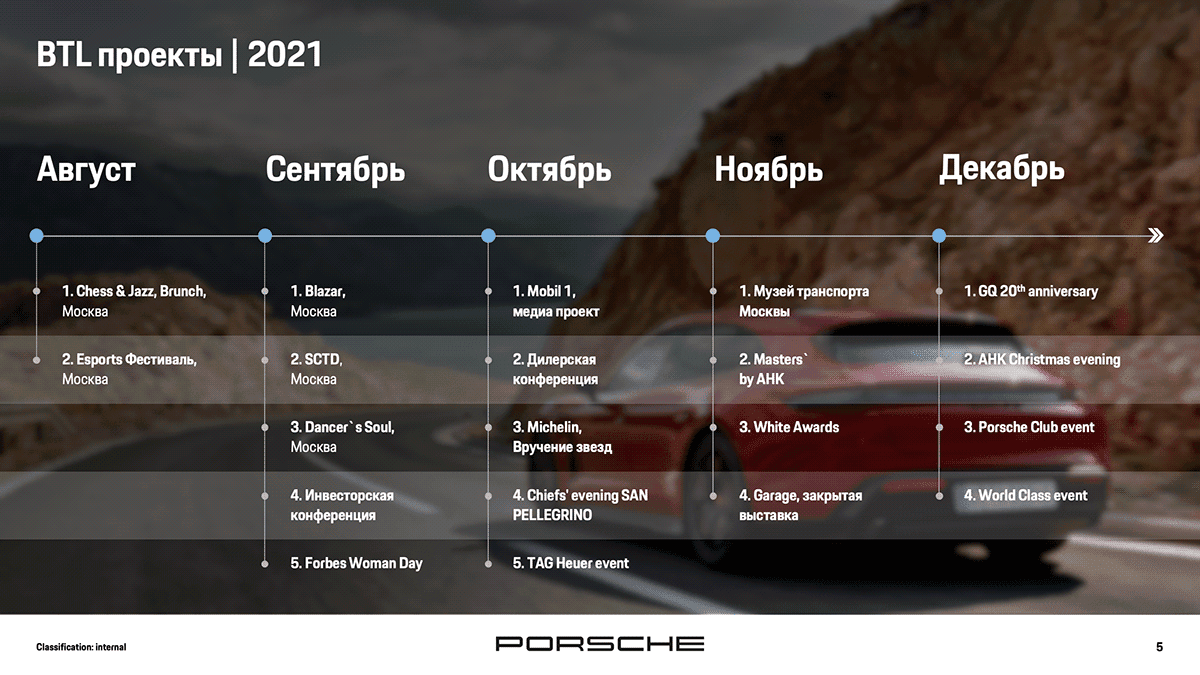
However, upon review, I realized that the central placement of the timeline hindered comprehension. Thus, I decided to reposition it to the bottom of the slide and added animation to distinguish active and inactive points during slide transitions.
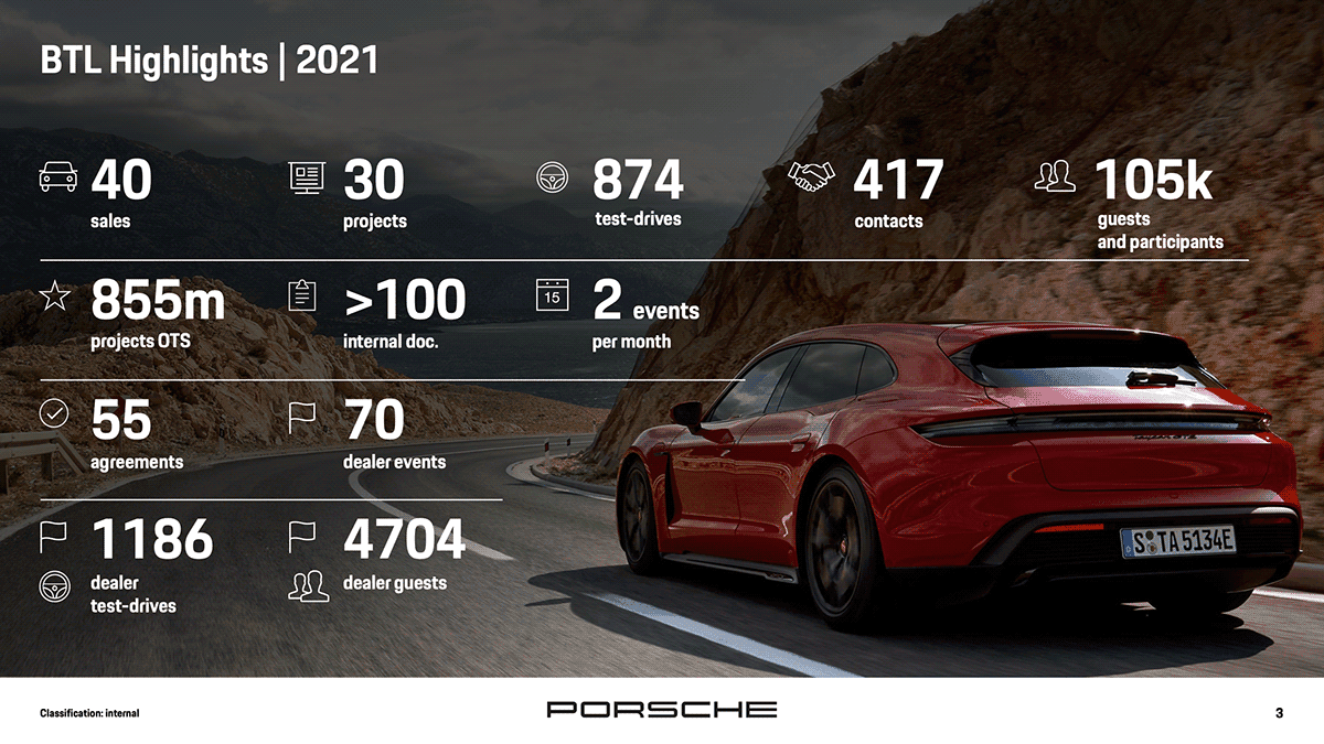
Final Version
Design Approach
Visual Enhancement:
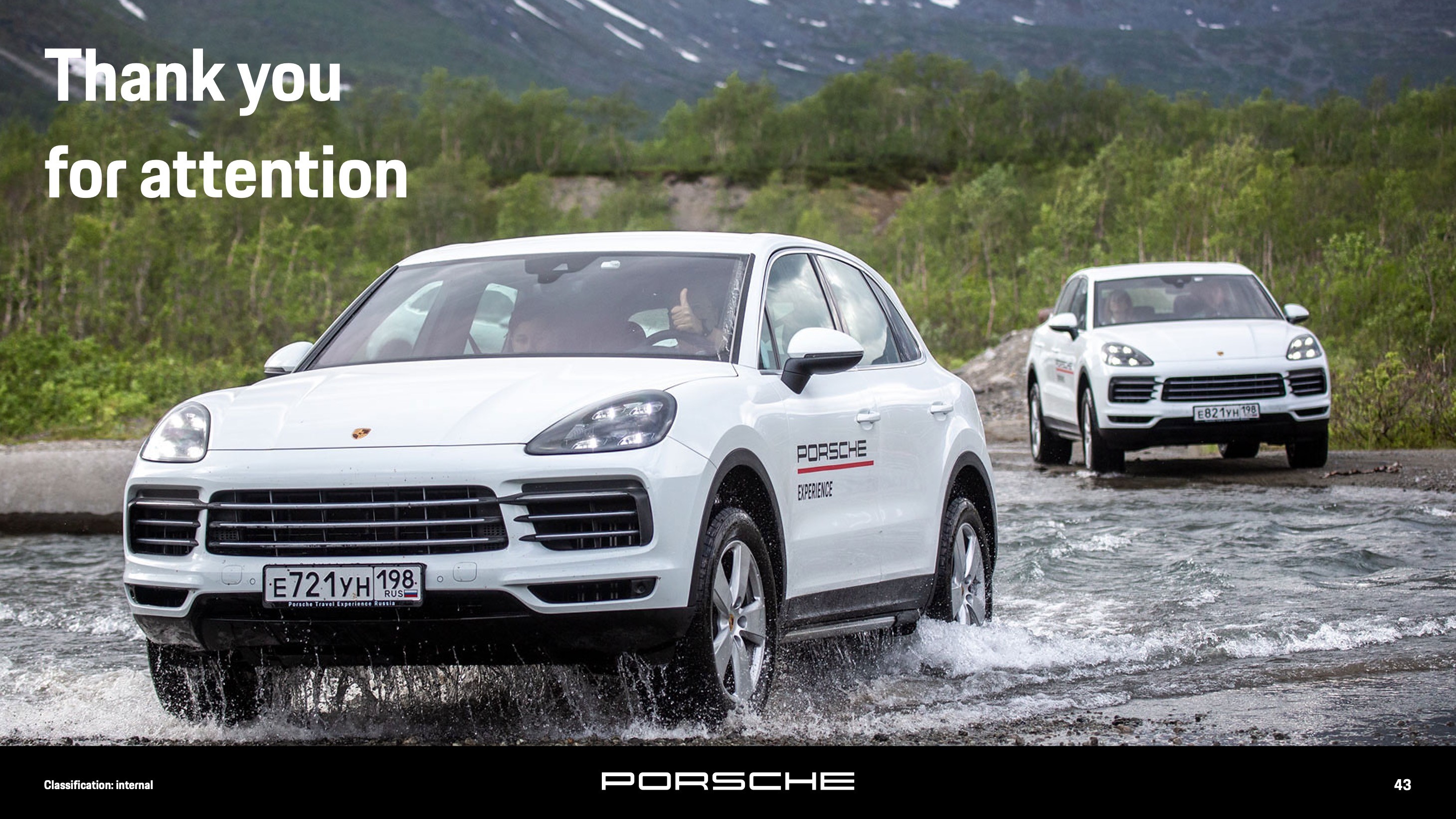
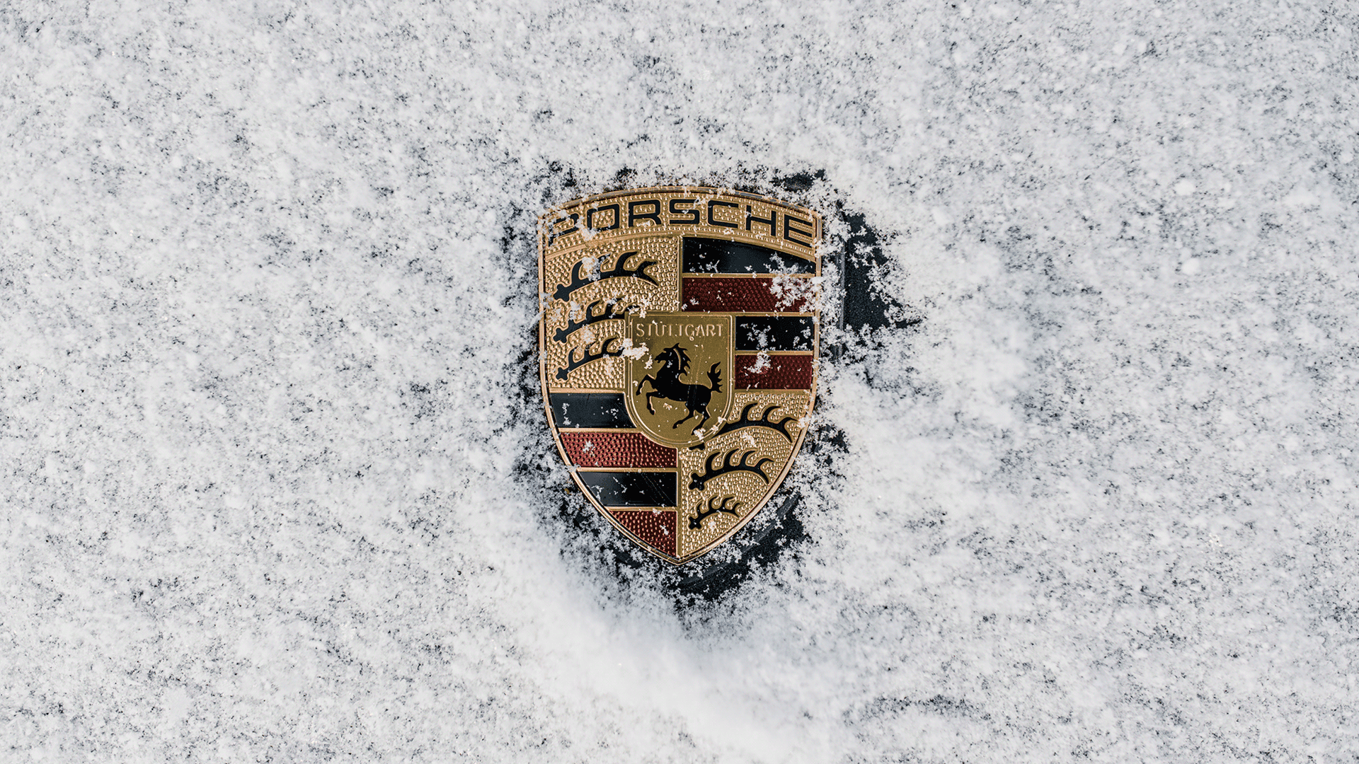
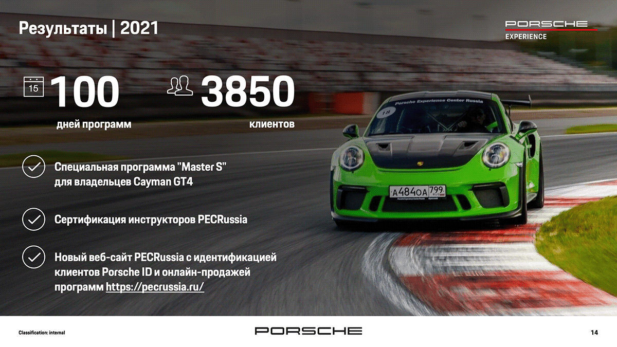
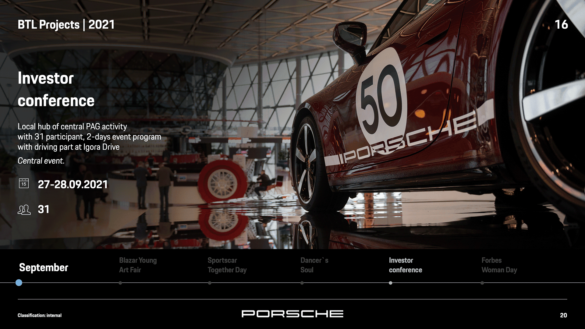
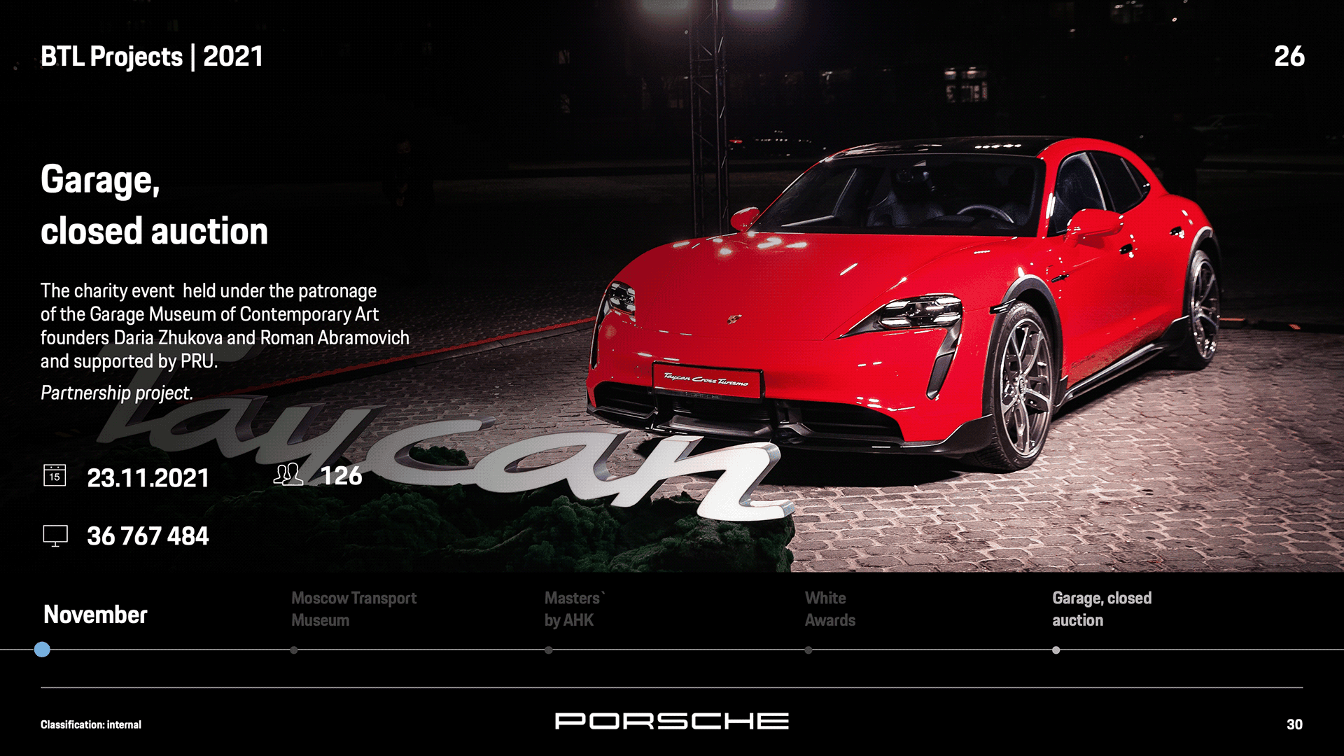
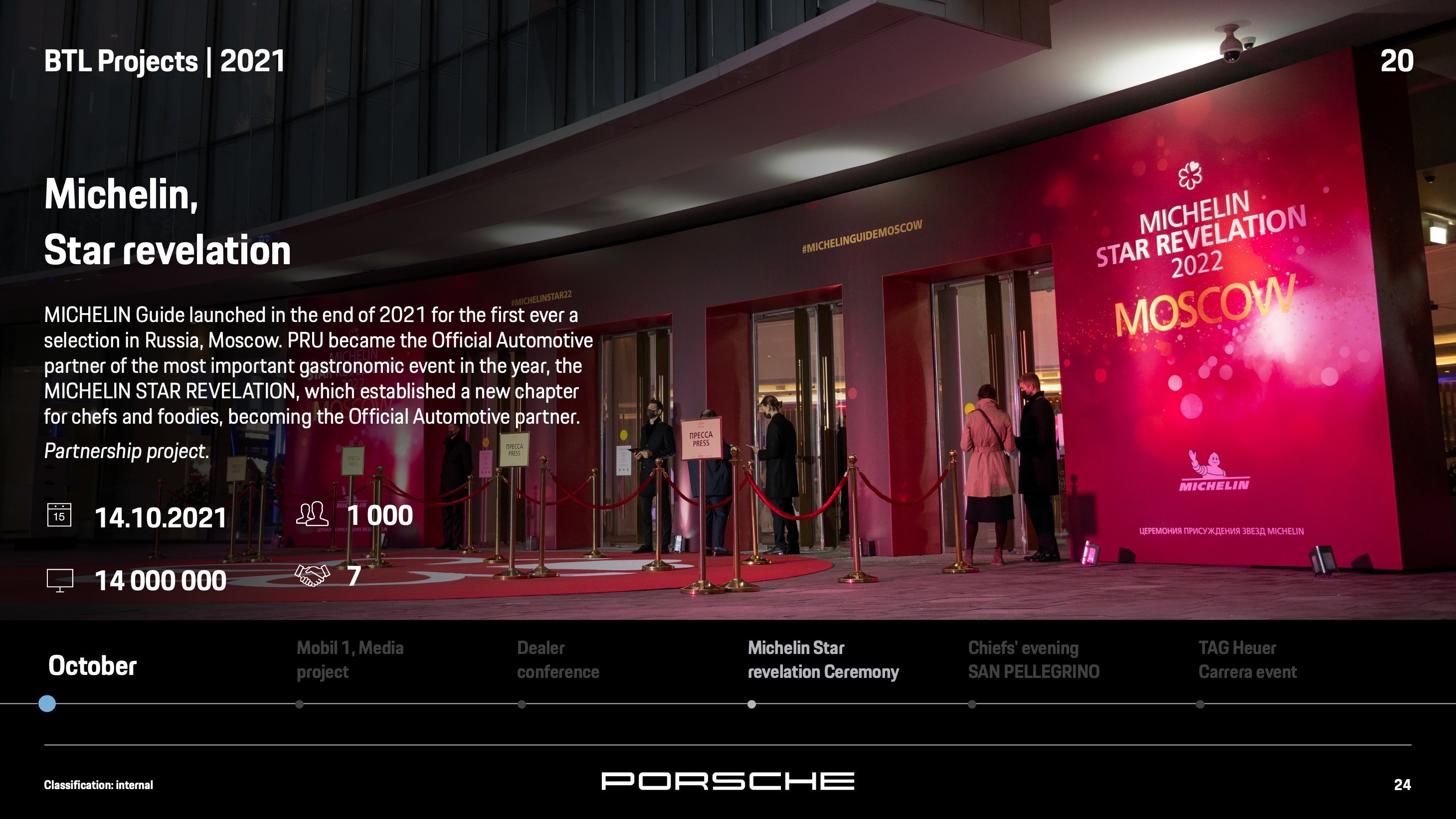
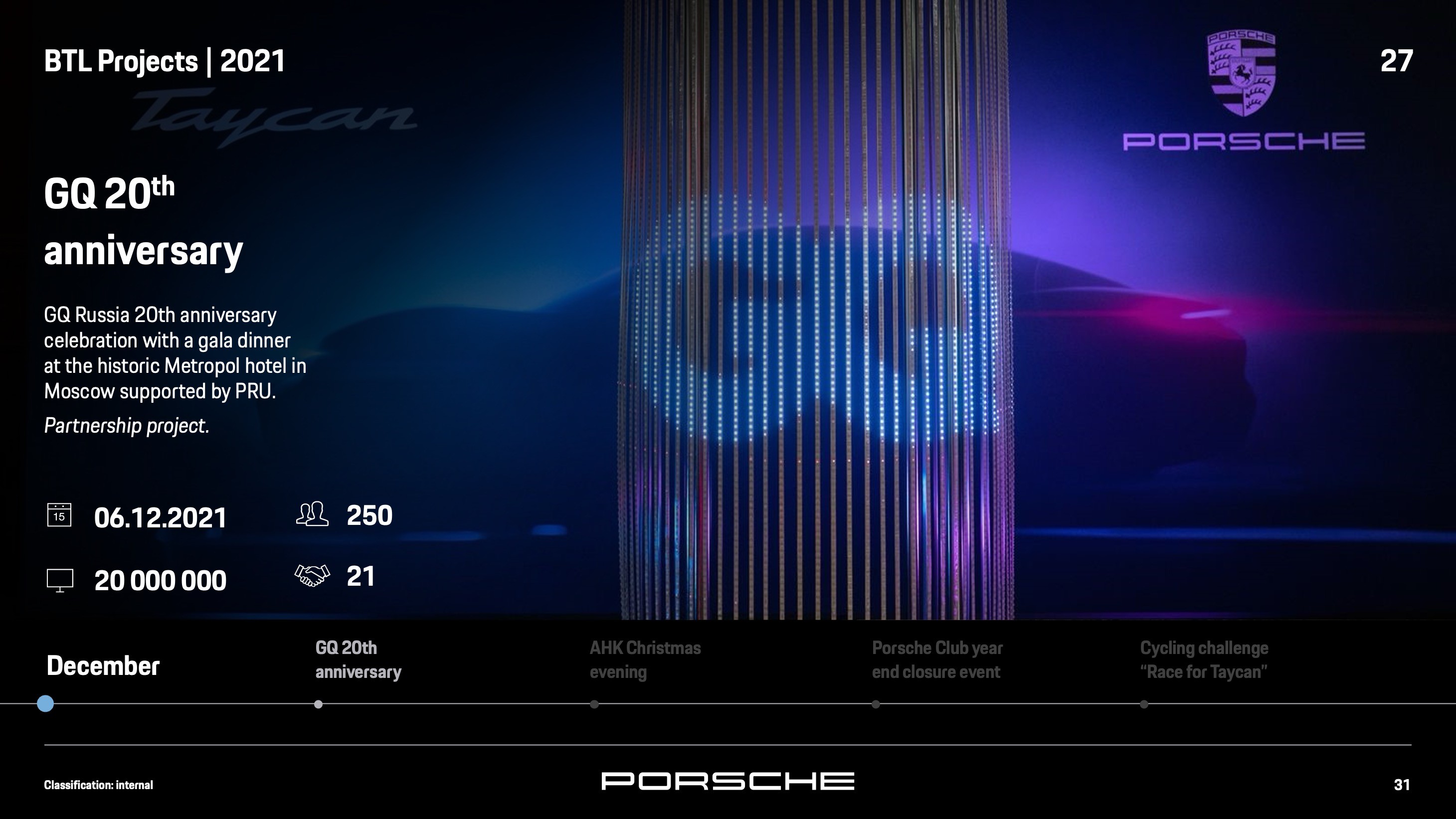
To create an engaging presentation, I integrated captivating visuals, including Porsche client photos, to complement the data-driven content. The addition of aesthetically pleasing imagery provided a sense of luxury and prestige that aligned with the Porsche brand image.
Expanded Slide Count:
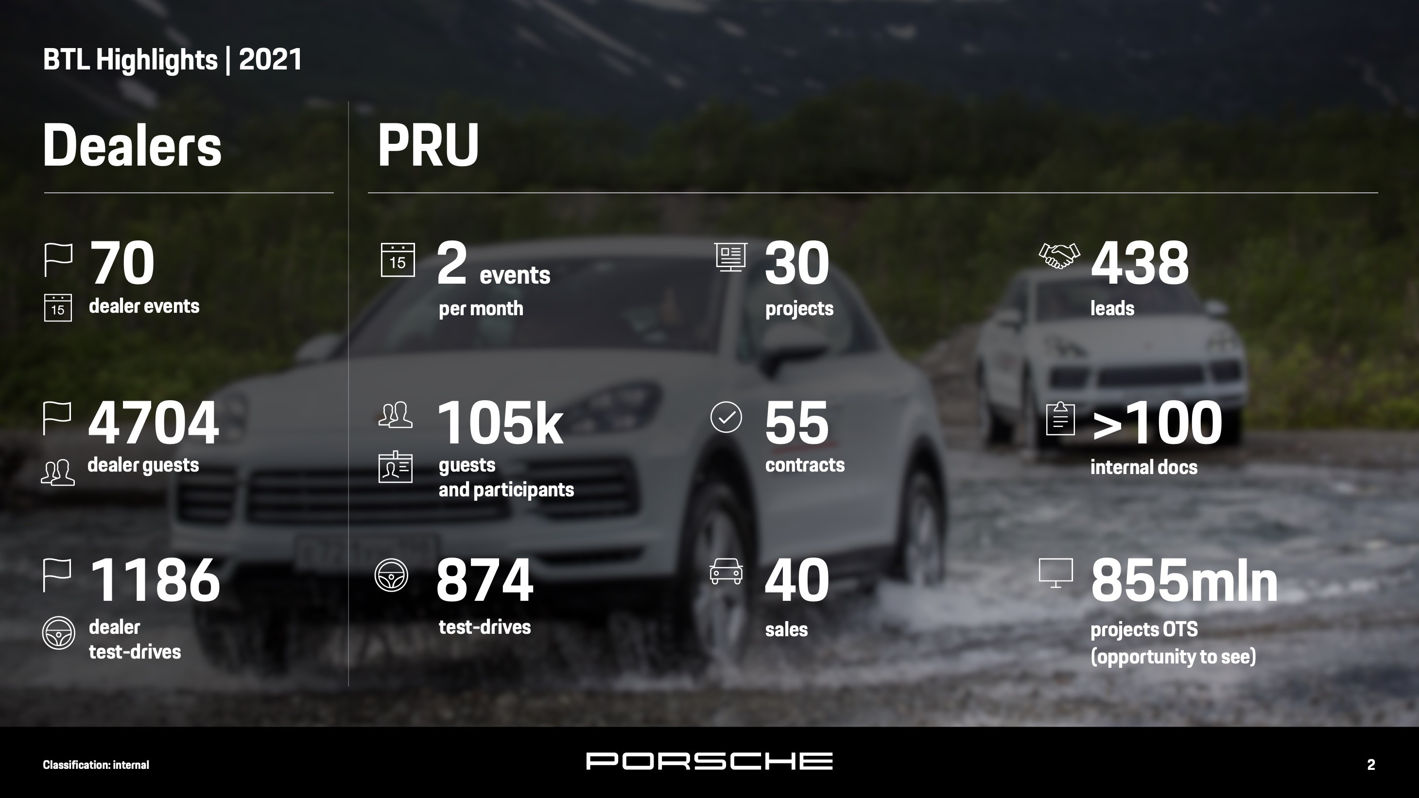
By expanding the number of slides, we ensured a more streamlined and reader-friendly presentation. Each slide focused on specific points, reducing clutter and enhancing overall readability.
Animated Timeline:
The timeline was a pivotal element in presenting the data effectively. I relocated it to the bottom of the slide to improve user experience and clarity. Additionally, I introduced subtle animation to highlight active and inactive points during slide transitions, creating an interactive and engaging flow.
Results
The redesigned Porsche presentation proved to be a resounding success. The incorporation of captivating visuals, expanded slide count, and the interactive animated timeline significantly enhanced the overall presentation experience.
The client was highly satisfied with the final result, as the new design effectively communicated data and information while maintaining a luxurious and polished aesthetic.
Conclusion
This case study illustrates the successful redesign of a presentation for Porsche, showcasing our ability to enhance data-driven content with engaging visuals and animation.
The expanded slide count and repositioned animated timeline improved the presentation's readability and user experience, resulting in a more compelling and visually appealing final product.
The client's positive feedback confirmed the effectiveness of our approach, underscoring our capability in delivering impactful and captivating presentations for luxury brands.